IU Diabetes Tracker
People with type 1 diabetes have crucial daily self-management tasks to keep their blood glucose levels in check. They need to regularly measure blood glucose, take necessary medications or insulin, eat the right foods, and monitor symptoms closely. The IU Diabetes Tracker offers a comprehensive solution for tracking glucose and blood pressure daily, weekly, and monthly, while also providing daily meditation reminders.

Role
Independent Designer
Collaborator
PM, Engs
Design Process
Problem finding > Literature review > Interview > Competitive analysis > Concept mapping > Wireframing > Cognitive walkthrough + Reliability Test > Low-fidelity Prototype > High-fidelity prototype > Interactive prototype
Duration
3 weeks
Tools
Sketch, Principle
Outcome
Users report a significantly better experience, indicating that the product is ready for shipment.
Current Issues
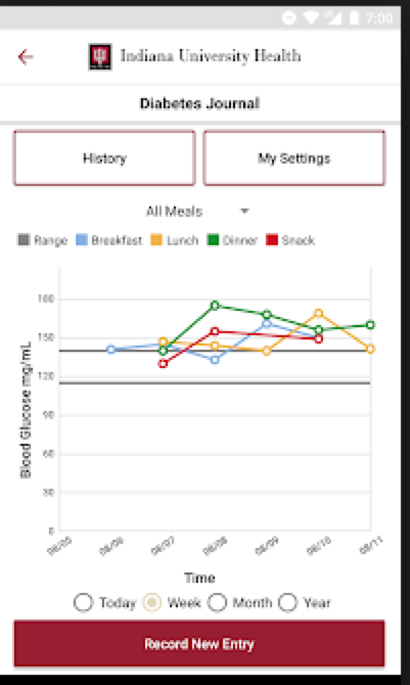
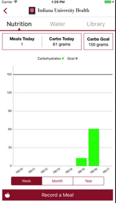
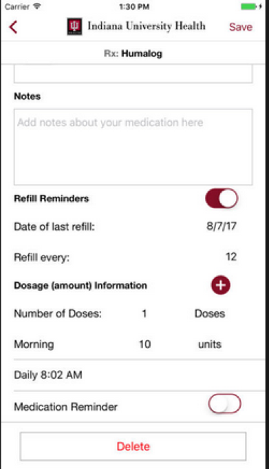
A significant number of residents in Indiana depend on the IU Diabetes Tracker every day for essential tasks such as monitoring glucose levels and receiving meditation reminders. Despite its potential, the app falls short of user expectations. Users frequently express frustration over its poor usability, limited functionality, and unattractive design. These issues create obstacles in managing their health effectively and can lead to decreased engagement with the app.
The app’s complicated interface makes it difficult for users to navigate and access critical features quickly. Its limited functionality means it lacks essential tools that could help users manage their diabetes more comprehensively. Additionally, the unappealing design detracts from the user experience, making it less likely that individuals will stick with the app over the long term.
Literature Review + Interviews
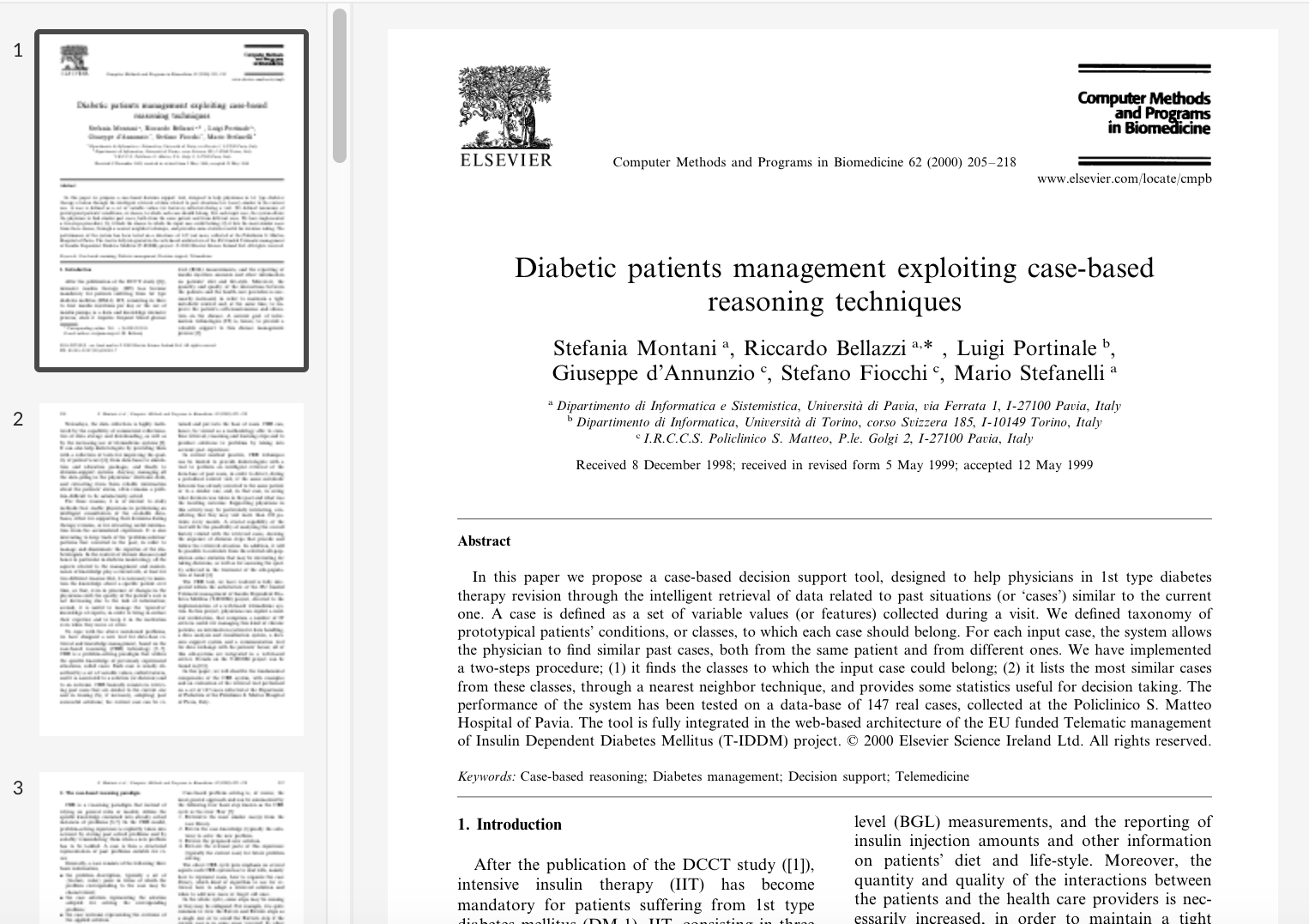
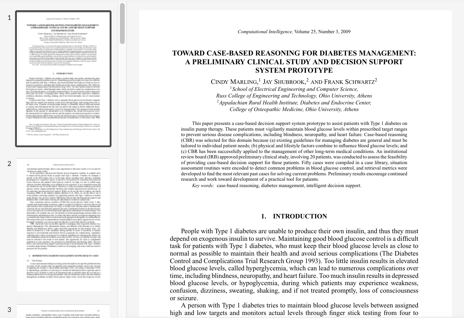
To deepen my understanding of Type 1 diabetes, I conducted a comprehensive literature review and interviewed several medical practitioners and individuals with Type 1 diabetes. The goal was to learn how users utilize smartphone apps to track daily information, including blood glucose levels, weight, blood pressure, and insulin injections, which are essential for maintaining stable glucose levels. Additionally, I aimed to identify the main problems they encounter with these apps.
Primary interview questions:
- How often do you use smartphone apps to track your blood glucose levels?
- How user-friendly do you find the current diabetes management app you use?
- What functionalities do you find most useful in your diabetes management app?
- Are there any features you feel are missing or could be improved?
- What are the main problems you face when using your current diabetes management app?
- What additional features would you like to see in a diabetes management app?
The primary findings:
- Frequency: Users track blood glucose levels multiple times daily, indicating these apps’ essential role.
- Ease of Use: Many find current apps challenging to navigate, leading to frustration and inconsistent use.
- Useful Features: Automatic data logging, medication reminders, and comprehensive health tracking are appreciated.
- Missing Features: Users want personalized insights, better integration with other health apps, and improved recommendations.
- Main Problems: Frequent technical glitches, slow performance, and poor design significantly hinder usability.
- Desired Enhancements: Users desire real-time syncing with health devices, customizable alerts, and better data visualization tools.

Competitors Analysis
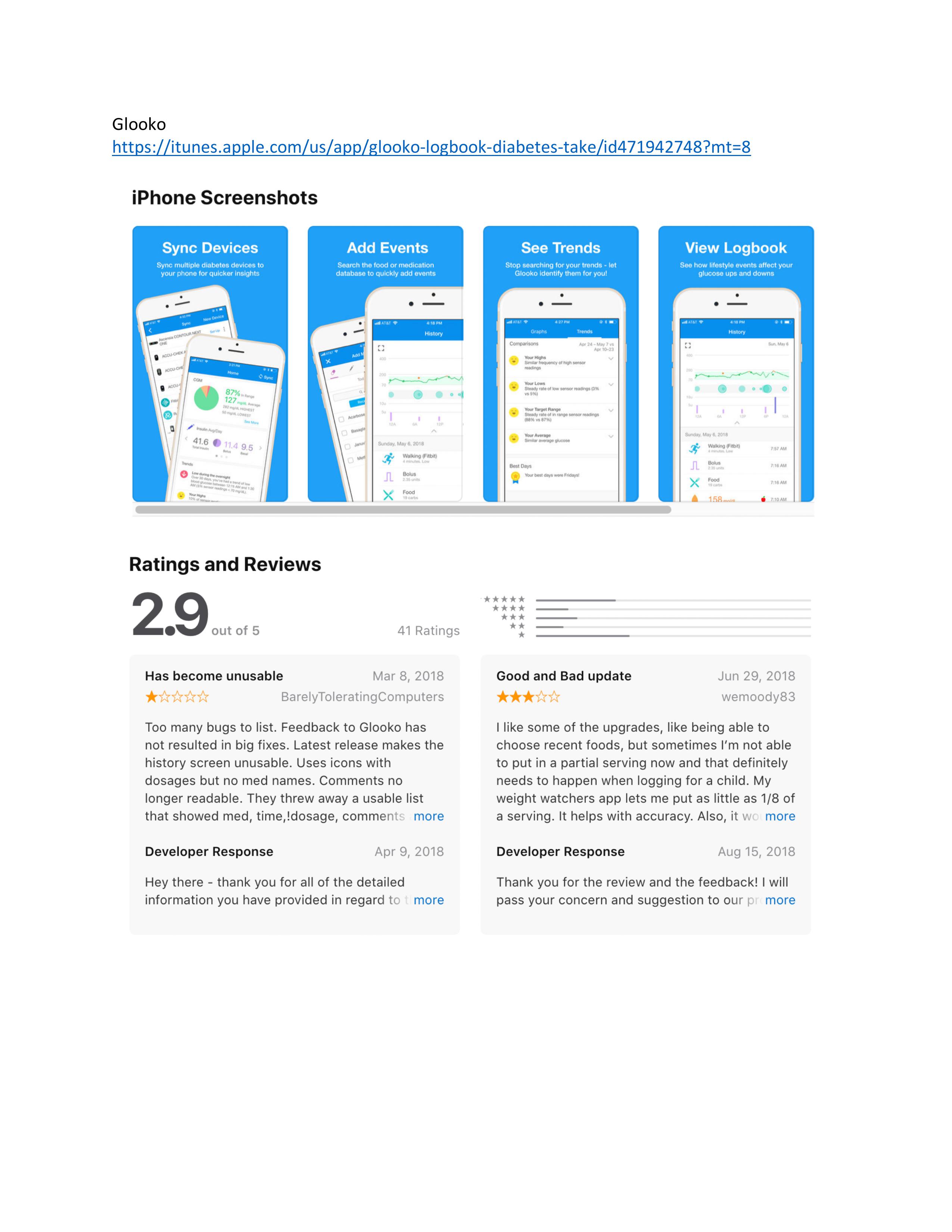
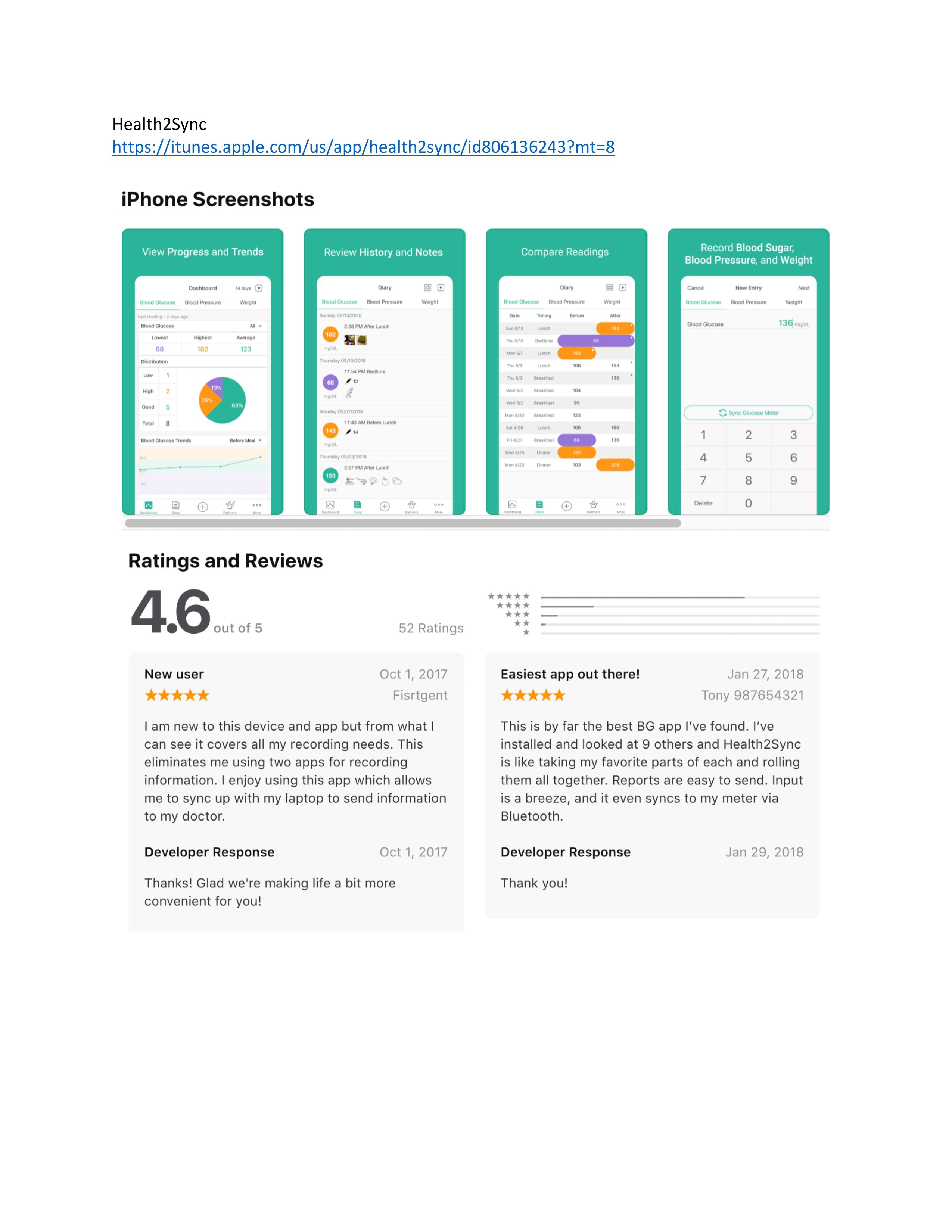
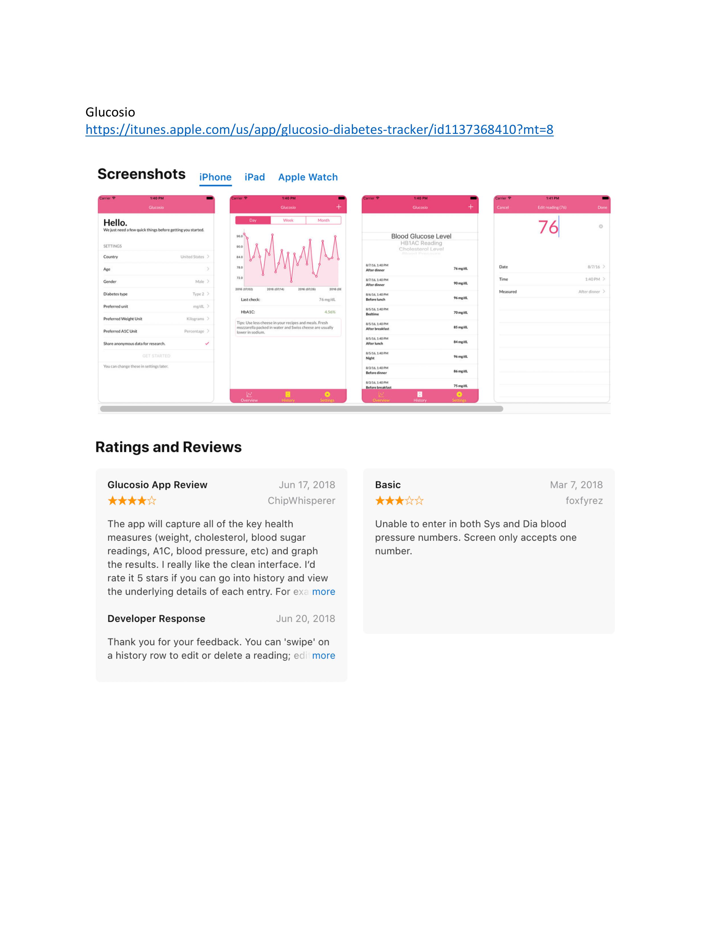
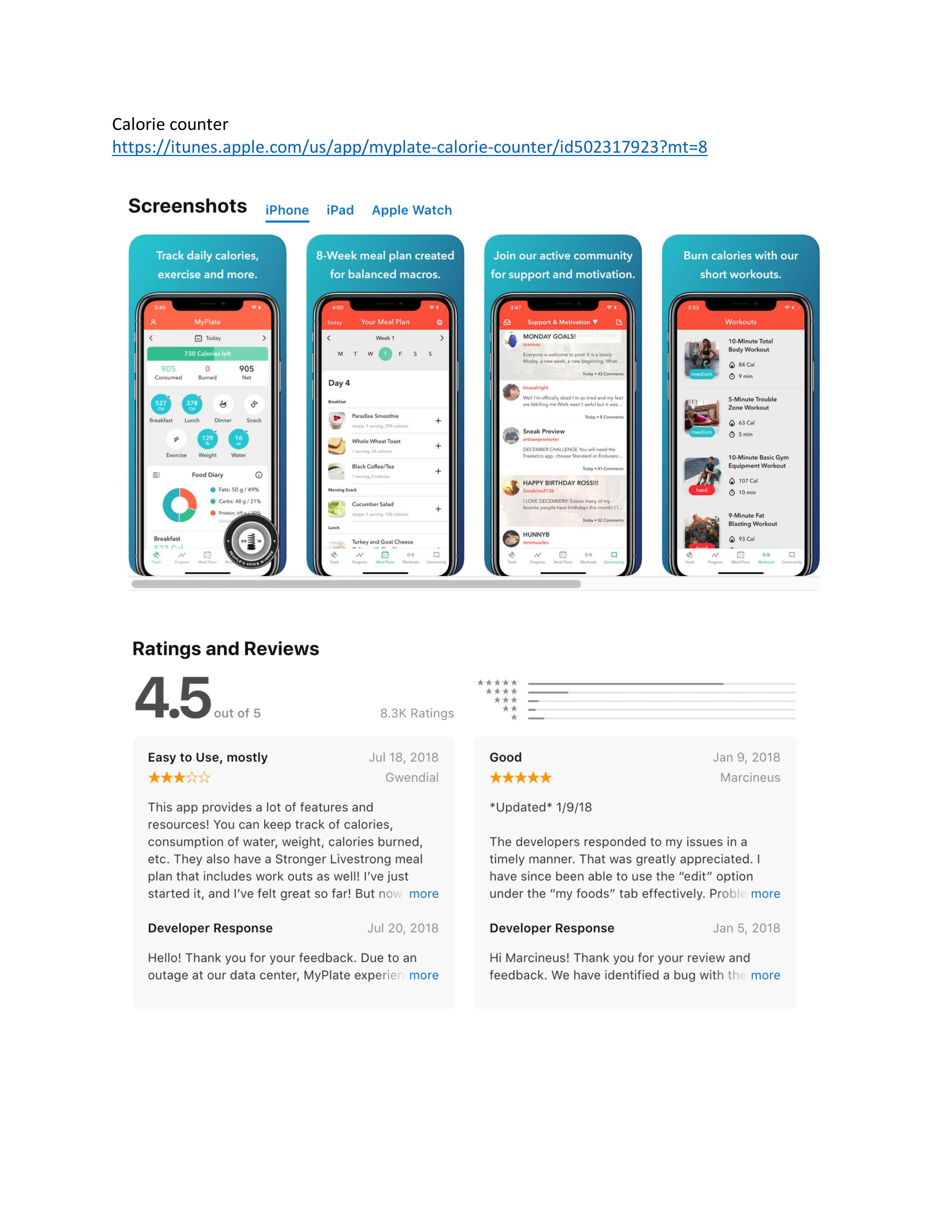
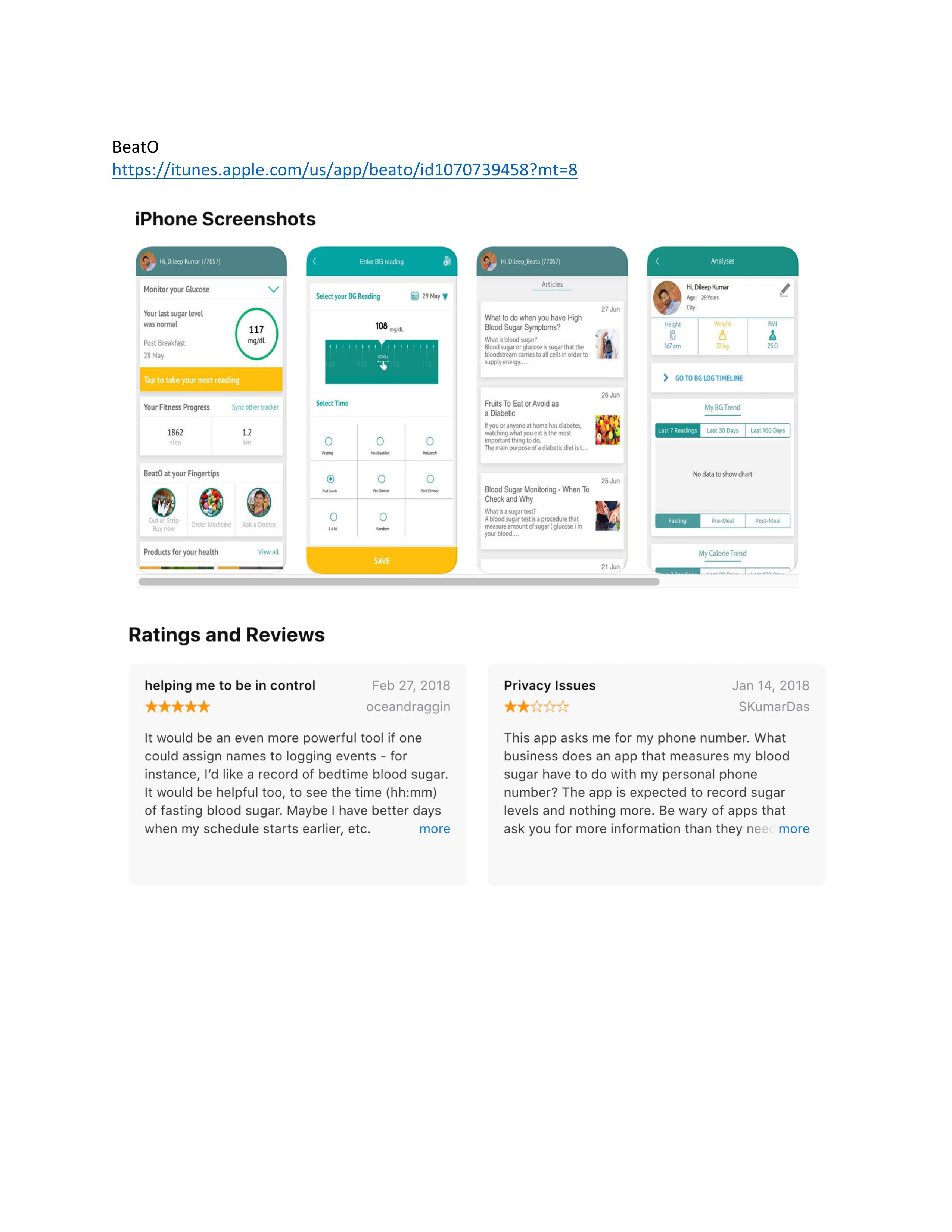
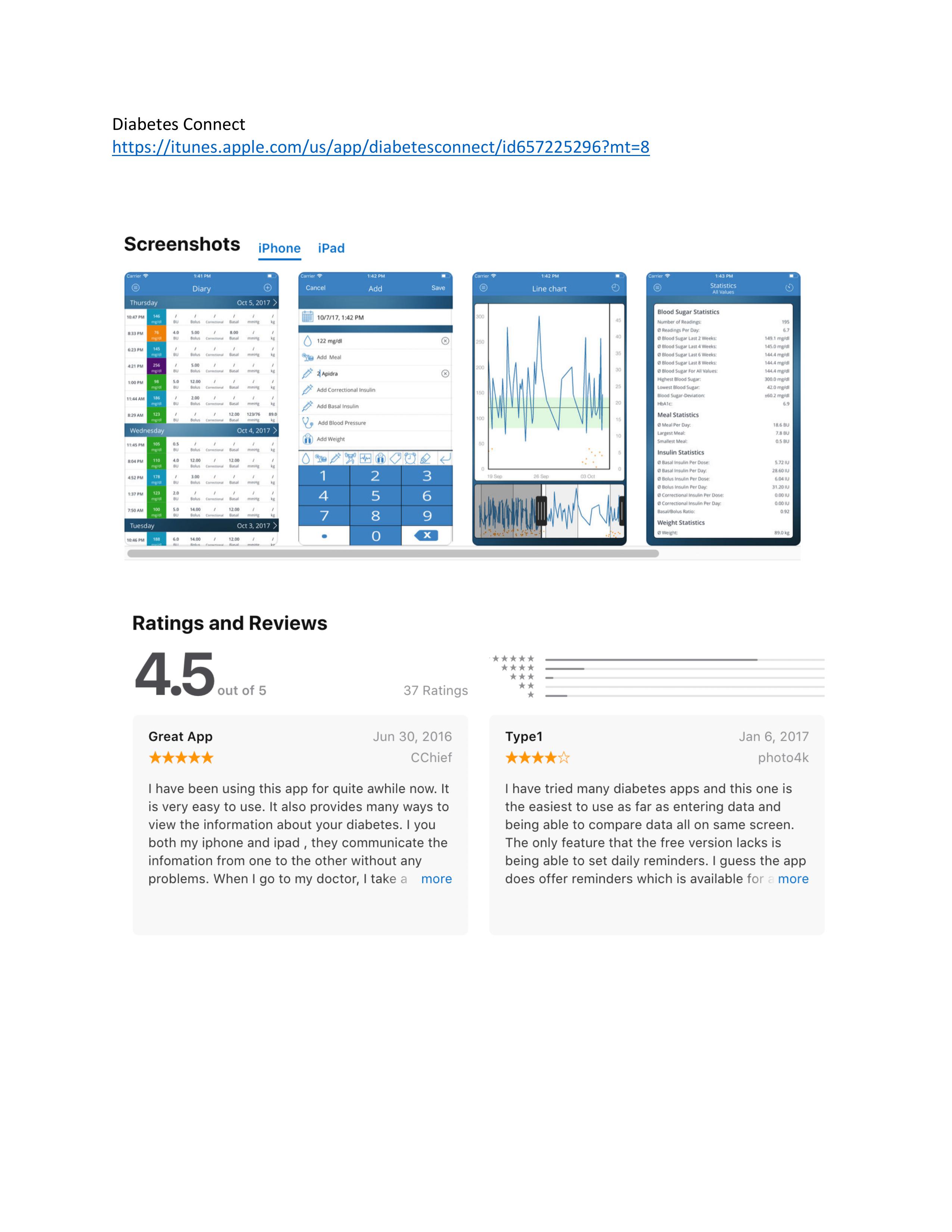
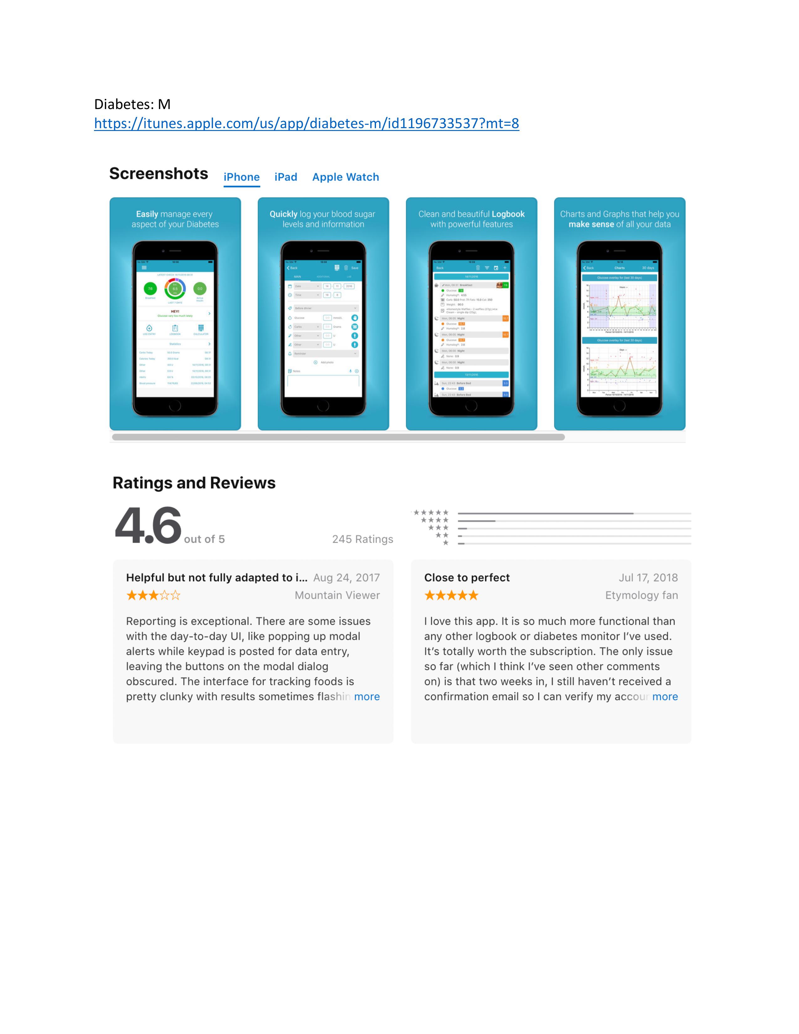
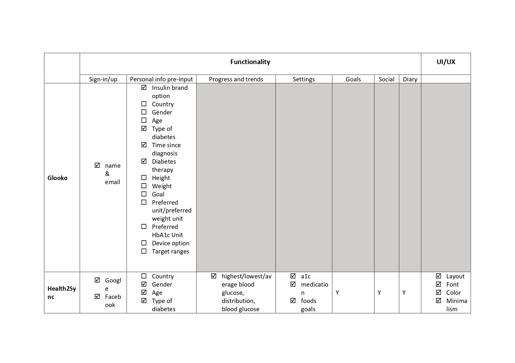
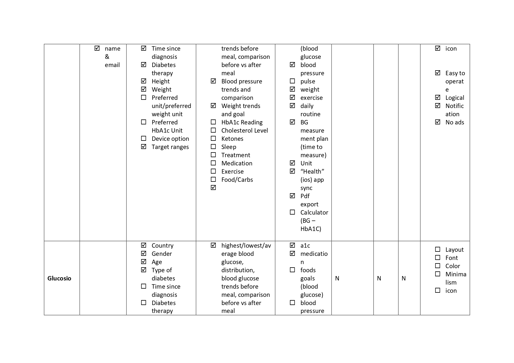
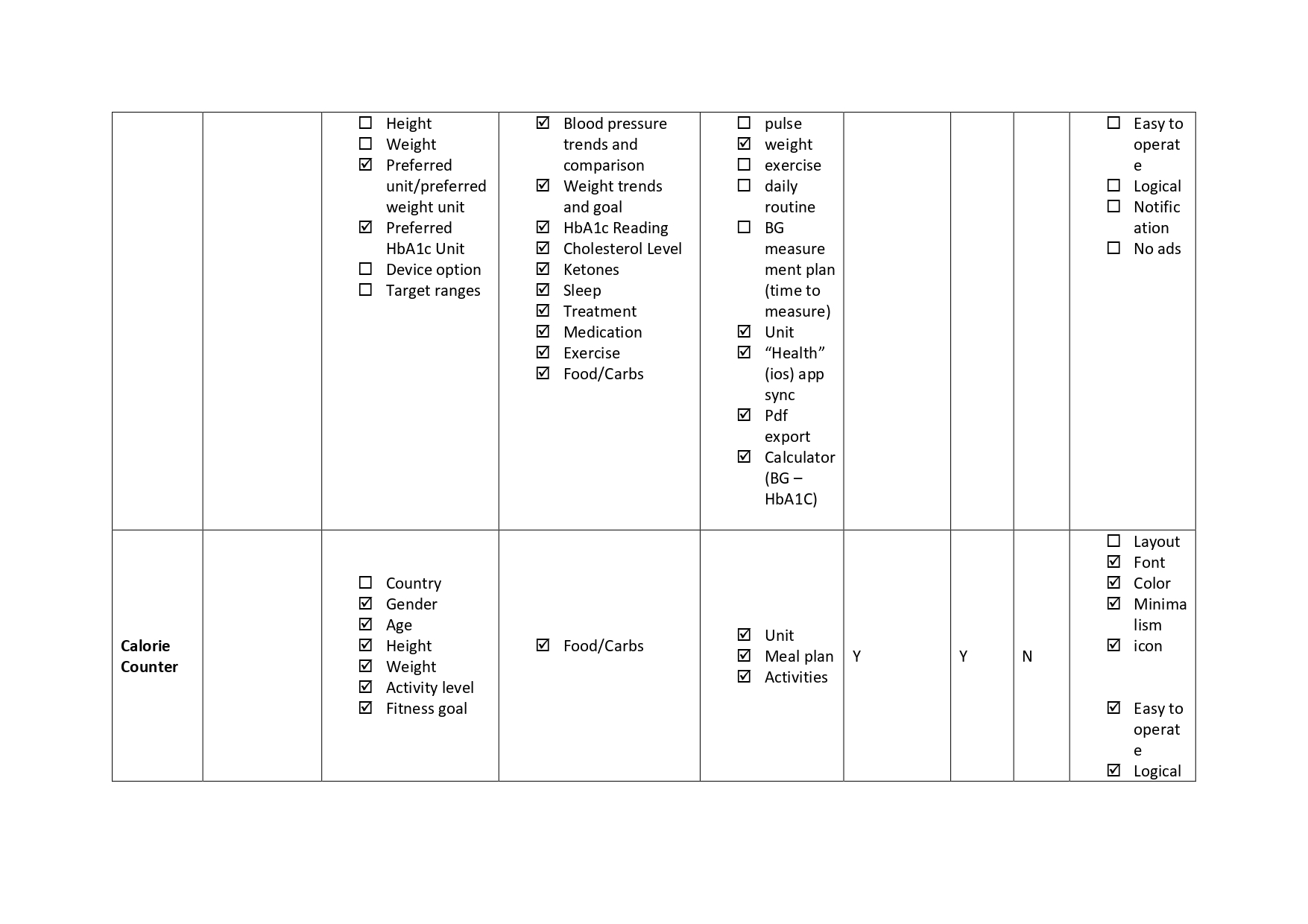
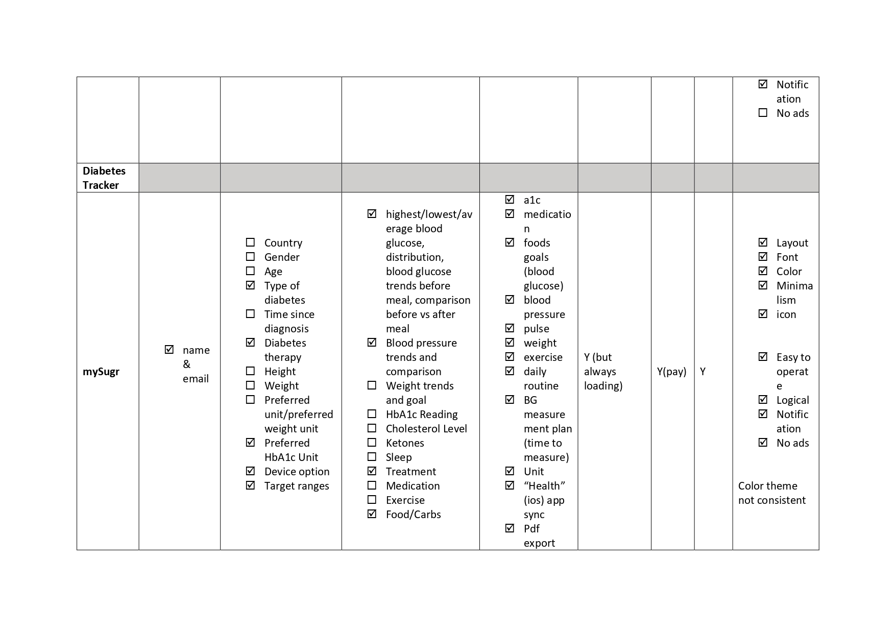
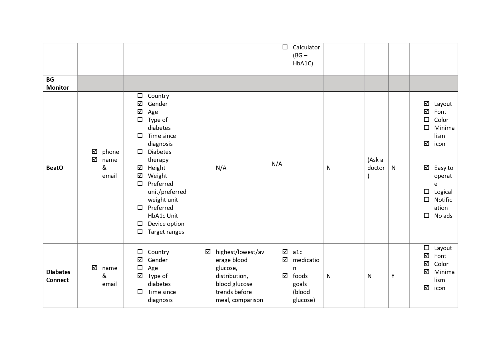
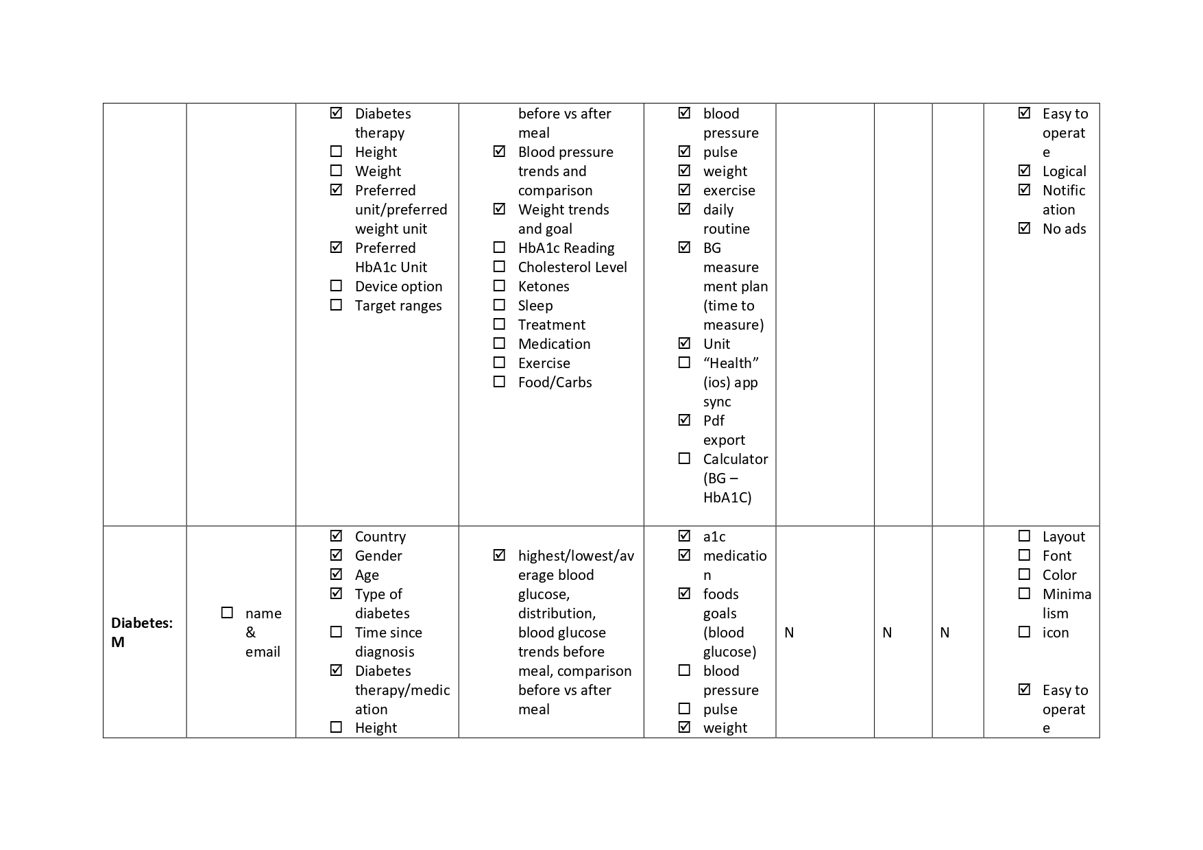
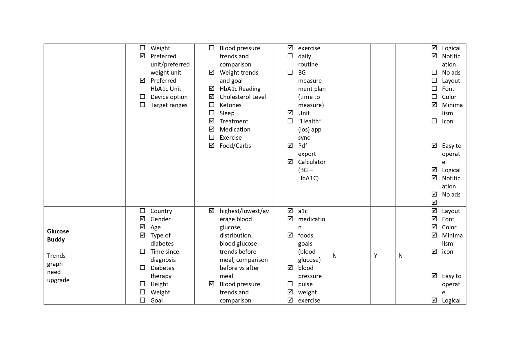
Then, I downloaded nine diabetes management products currently available on the market. My goal was to assess their strengths and weaknesses across three critical areas: functionality, usability, and visual design.
By examining these aspects, I aimed to understand how existing products perform in helping users manage their diabetes, identify best practices, and pinpoint areas where these apps fall short. This research provided valuable insights into what features and design elements contribute to a successful diabetes management app and highlighted opportunities for improvement.
Functionality
Strengths:
- Comprehensive tracking of glucose, insulin, meals, and exercise.
- Integrated reminders for medication and testing.
Weaknesses:
- Lack of real-time syncing with health devices.
- Missing personalized insights and recommendations.
- Limited reporting and data export options.
Usability
Strengths:
- Intuitive interfaces with clear navigation in some apps.
- Onboarding tutorials for first-time users.
Weaknesses:
- Complex, cluttered interfaces causing frustration.
- Frequent technical glitches and slow performance.
- Inconsistent experiences across devices and systems.
Visual Design
Strengths:
- Modern, pleasing designs with effective color coding.
- Clear visual cues for data interpretation.
Weaknesses:
- Outdated, unattractive designs.
- Poor visual hierarchy and limited customization options.


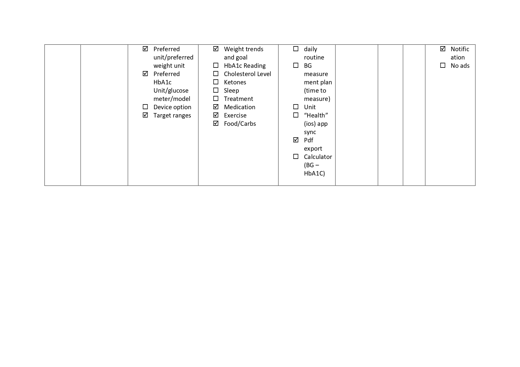
Concept Mapping – Frustration Point
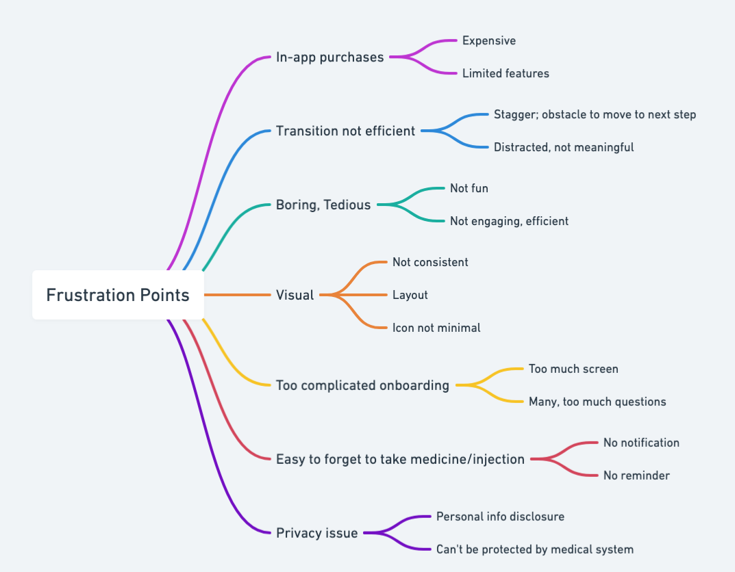
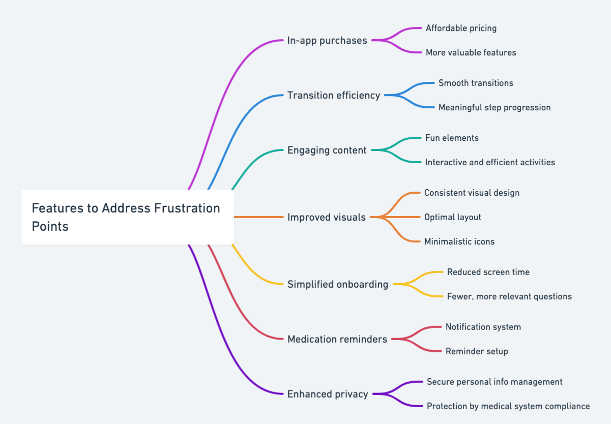
To organize the collected data and uncover the sources of user frustration, I created a concept map. This helped me delve deeper into the specific reasons why users experience frustration when using the product.
In-app Purchases: Costly and insufficient paid features.
- Transition Efficiency: Poor transition steps, distracting and obstructive.
- Engagement: Boring, inefficient, and lacks entertainment.
- Visual Design: Inconsistent design, problematic layout, complex icons.
- Onboarding Process: Cumbersome with too many screens and questions.
- Medication Reminders: Absence of notifications and reminders.
- Privacy Concerns: Disclosure of personal information and inadequate protection by the medical system.
Wireframes
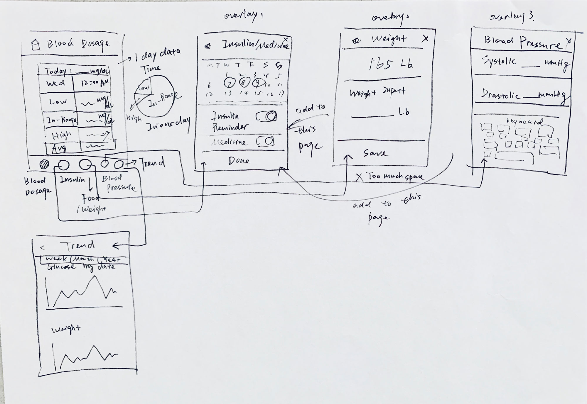
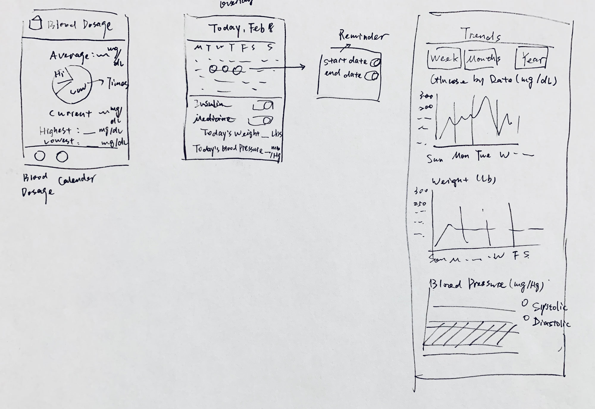
To organize and prioritize our features, I started by creating wireframes and sketches, which I then converted into a low-fidelity prototype. I conducted iterations using cognitive walkthroughs and usability tests to refine the design. Here are the SUS results to gauge user satisfaction with the design.
Average SUS Score: The average SUS (System Usability Scale) score is 73.0.
Grade Distribution:
A: 3 occurrences
B: 2 occurrences
C: 2 occurrences
D: 1 occurrence
F: 2 occurrences
The data shows a range of SUS scores from 32.5 to 95, with the majority of scores falling in the higher range, resulting in more ‘A’ grades. However, there are also low scores resulting in ‘F’ grades, indicating some variability in user satisfaction. The average score of 73 suggests overall decent usability, but there are areas for improvement to achieve more consistent high scores.
Low-fidelity Prototypes (Iterations)
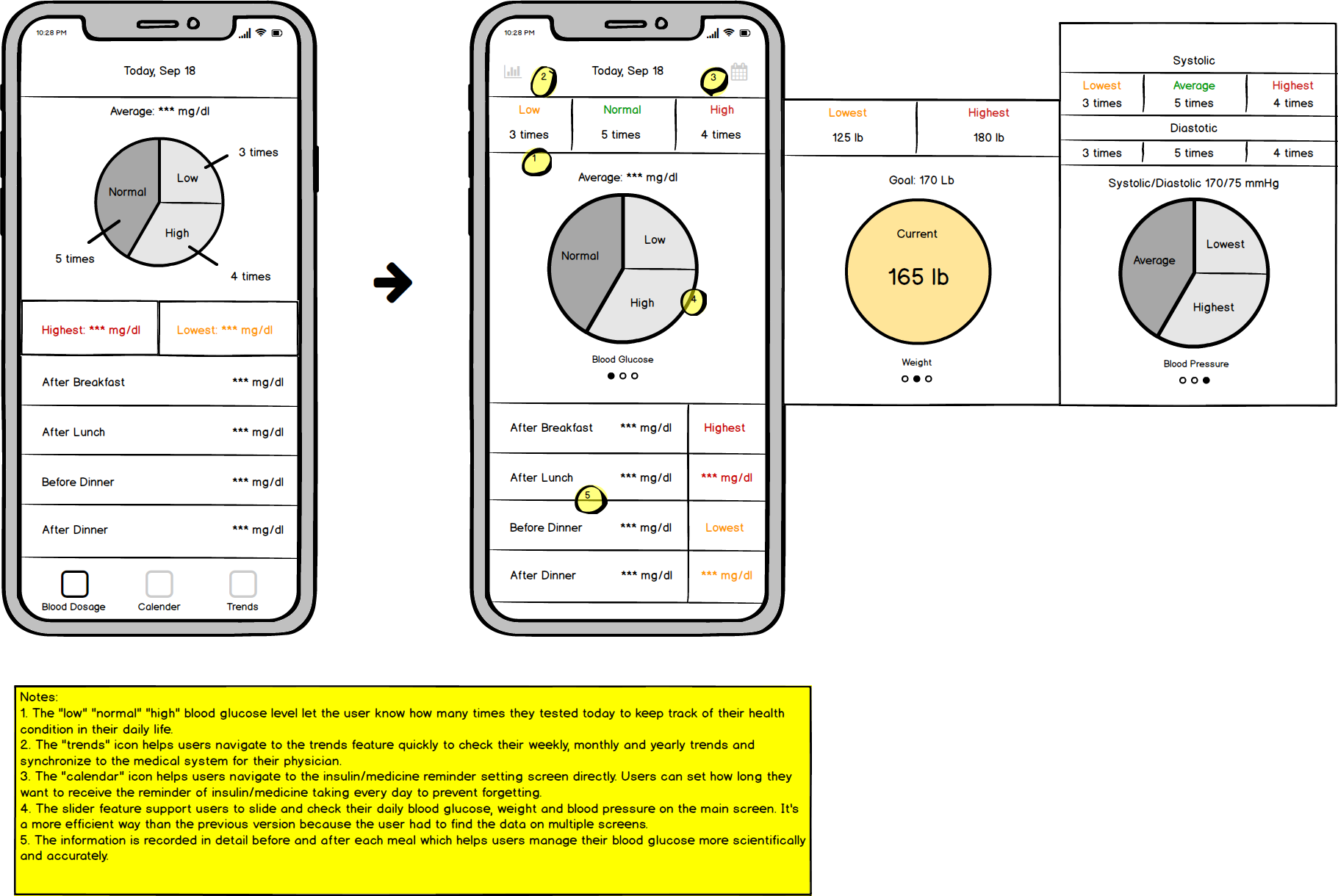
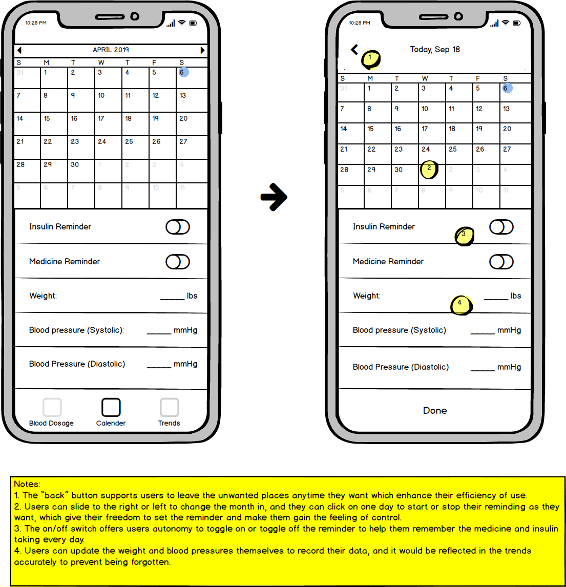
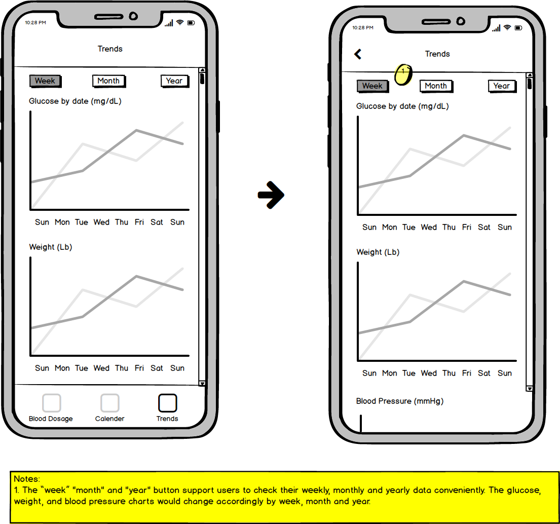
Based on the SUS test results, I began creating low-fidelity prototypes and improved the following aspects:
- Enhance clarity in displaying information.
- Improved the display to help users gain a complete picture of their blood glucose, weight, and blood pressure.
- Enabled users to check data changes before and after each meal.
- Increase the color contrast on the dashboard for better usability.
- Moved the “trends” and “reminder” navigator to the top to save space and improve data checking efficiency.
High-fidelity Prototypes + Interactive Design
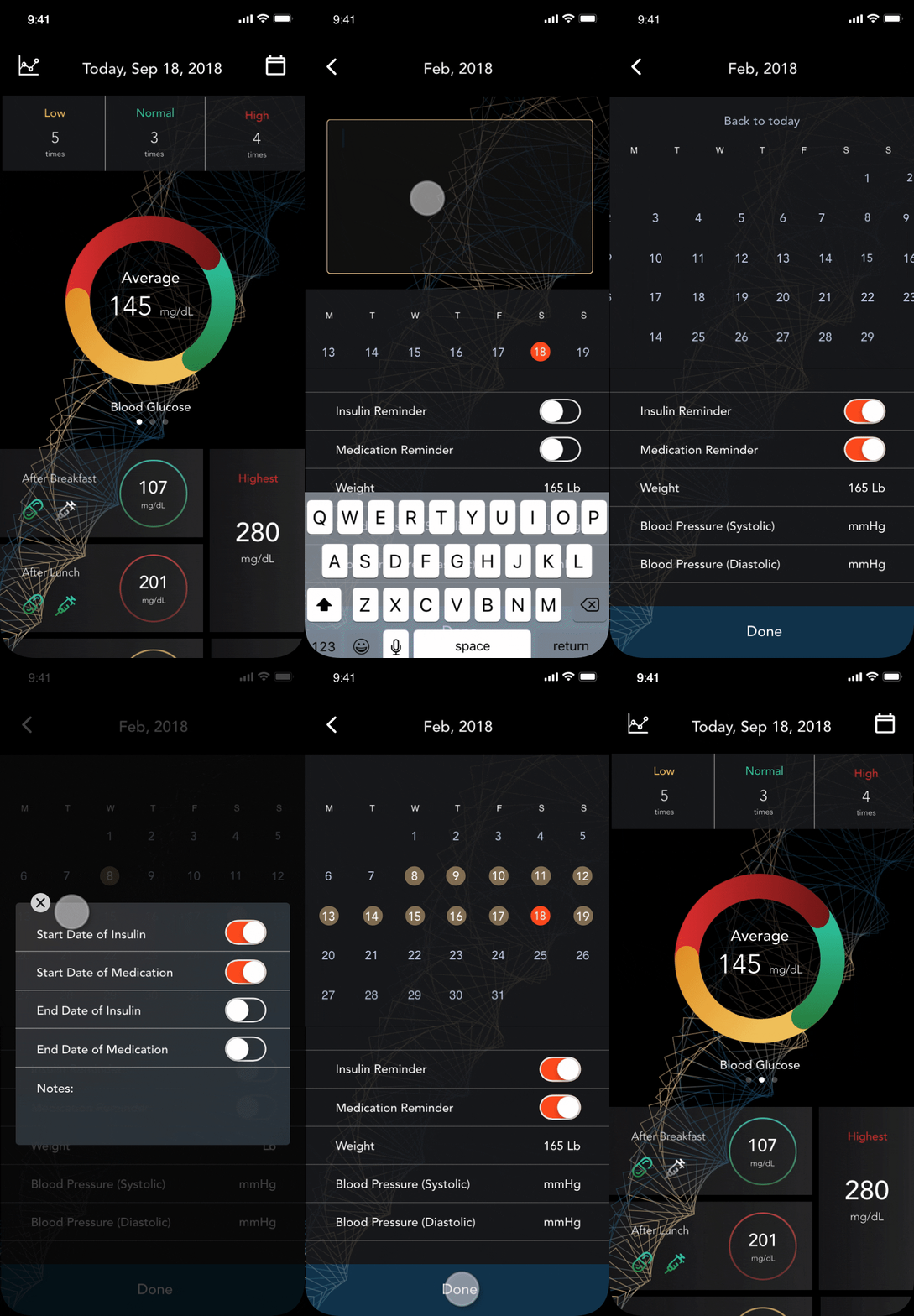
After all the low-fidelity iterations, I developed the final high-fidelity prototype with interactive motion, and created a new design library for this app, making it easier for engineers to grasp our design ideas regarding color, text, layout, and interaction.
According to the latest requirements, the future vision for the product involves integrating this management system into a 3D game, providing users with an enjoyable experience while managing their diabetes. The desired tone and style of this app are engaging and surreal, setting it apart from existing diabetes management apps on the market. Here are some changes and refinements made in this phase:
• Different colors indicate the user’s health condition: red and yellow signify caution or emergency, while green indicates normal.
• Highlighted injection/medicine icons on the meal panel remind users to take insulin or medicine before or after each meal.
• A notes feature was added for users to record important messages for their physicians to review.
Future Steps
As we pivot our strategy towards a more gaming-like experience, I can’t yet integrate my screens into the game scenarios due to potential conflicts in tone and style. Further adjustments and refinements will be needed, working closely with other team members, to ensure consistency and functionality as the game development progresses.
Given that this is a real-world product, the landing page and onboarding process should be designed in the future to reinforce the brand and align with the game theme.
In the next phase, I aim to explore how transitions, motion, and animations can be used to enhance user engagement and retention.
Like what you see? Hit me up :)
